


The Design Review
I've been designing daily for the last few weeks. Now seems like a good time to look back and review what works, what doesn't and how to continue my growth.
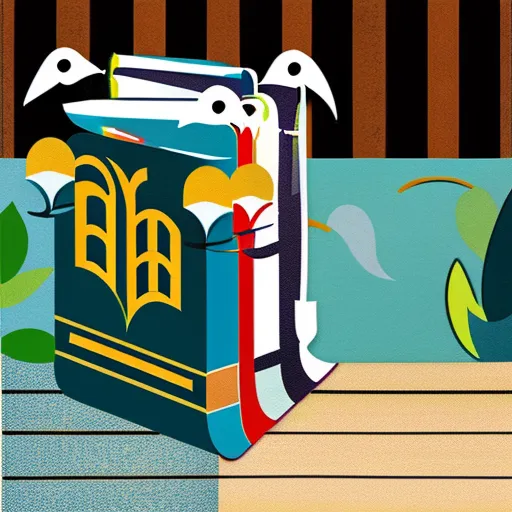
1. Jk. Rowling
My first design. It's too plain.The words need more space (Maybe I should set a limit on how many words a design has).The canvas size is wrong.
Plus - I enjoy the drawing.
Takeaways - Keep the drawing. Add something to the background. Break up the text a bit. Add colour/effects to the text. Add a sense of magic to the design. Use the right canvas size.

2. Twitter
Another one from my first set. Again it's too plain.The text needs to be broken up. Shadow/colour could liven up the text. A gradient background on a patten design could add more life to the design.

3. Muslim Extremist
Again the words need to be broken up.Another font may work better. Black and white works well. I like the eyes.

4. Surf The Waves Of Chaos

Really like this. A new colour for the first letter works well.I like the font. The shadow works well..I could add water droplets as a pattern. A cartoon surfing cat (or any chaotic thing surfing) will bring this design to the next level.

5. Appreciate the little things
I love this. The colours work well together. I like the font.The background is simple, but it works. The 'Catline Jennet' at the bottom could be larger. Again I don't like the text being read like a book, could it be split up or is their too much test?

6. I'll Survive
This design looks perfect as it is. Maybe I could change the colour of the first letters.I could also draw my own heart design. I could offer different colour combinations . Multiple designs with very little effort.

7. JK.eep on Rowling
This is what I mean by breaking up text. Reading it is now effortless.Maybe I could add colour to the text/Change first letter. I like the background and the wand icon completes the design. Really happy with this one.

8. Easy!
This is super simple, but I love it. I don't know if I like the ! though, does it work? The brush stroke at the bottom could be different colours (Multiple designs, little effort).

9. Remember You Will Die
Broken up text works really well, I need to remember this when moving forward. Im not sure if I like the box background on the text. I'll experiment by replacing boxes with ink splats.The grunge font is perfect. The background doesn't work, the flame doesn't fit and the purple should be dark gray..

10. Final Thoughts/Rules
If lots of test, backgrounds shouldn't be plain. If minimal text keep background minimal.
First letter colour - It adds more life to the design.
Break up text - 3/5 words each section. Too many words feels like reading a book.
Pattern - Experiment with pattens as the background
Ink splats - Experiment with splats instead of boxes as text backgrounds.
Drawings - Add my own drawings to designs. Make them more personal.

Ask - What type of design do people like most? Focus on that.


No comments.